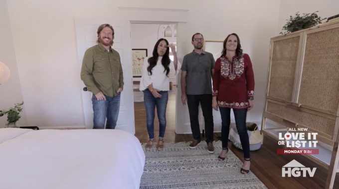
Last night we got to see the thought that went into designing the Ramsey’s house on Fixer Upper: Behind the Design. If you missed the original episode of Fixer Upper, you can find a full recap, including before and after photos, right here!
The Ramsey’s had been living in Pakistan for a number of years and decided they wanted to move themselves and their children back stateside. They found a house online and jumped at the chance of buying it without seeing it in person. They had seen their house for the first time when they did the walkthrough with Joanna and Chip. They really wanted this new house to have a Scandinavian and Moroccan style.
The one part of the house that we didn’t see in the original episode was the upstairs which was completely reworked for bedrooms and a bathroom for all the kids. Brooke had an idea about the bathroom upstairs during their design meeting, she really wanted the one bathroom to be split into two bathrooms for the kids.
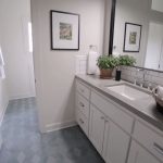
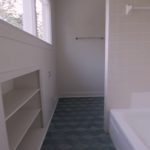
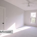
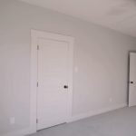
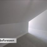
The upstairs had one big bedroom and one big bathroom, Chip split the big bedroom into two smaller bedrooms and did the same with the bathroom. They also have a teenage son that needs a very small room with something like a Murphy bed and Chip was able to find a space to do that also. Check out the pictures below to see how these rooms came out.
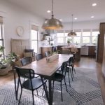
The living space in this house is huge, there is a kitchen with an island and then a dining room with an eight-foot table in it and then there is a fireplace that separates the living room. There was a fireplace there in the original house, but when they were doing the demo, they found that the fireplace was extremely unstable and had to be rebuilt. There was also a fireplace in the bedroom that had been boxed off and they opened that back up and put some really great tile up to tie it into the rest of the style. One of the biggest things that Jo wanted to keep from the original house was the glass in the front door.
This house really came together for the Ramsey’s and once the furniture came in, the style really started to take shape. The way the furniture and decor tied into the flooring, tiles and the glass on the front door was really amazing. The upstairs was left unfurnished so that the kids could add their own finishing touches to make them their own.
Here are some of the design elements that were highlighted in this episode of Fixer Upper: Behind the Design!
Gallery: Highlights from Fixer Upper: Behind the Design
The vanity in the second bathroom is exactly the same and they both open up to the shared shower and toilet. There were three bedrooms upstairs, two children in each and then the one with the slanted ceiling is for their older son. What did you think of last night’s episode of Fixer Upper: Behind the Design? Let me know in the comments below, on Facebook or on Twitter!

Be the first to comment