
Last night on Fixer Upper: Behind the Design season 1, we watched as Joanna went behind the design of her sister and brother-in-law’s home. Mikey and her husband David were looking for a new home for them and their five children. If you missed the details from the original episode of Fixer Upper, you can find our full recap right here! Like every other episode of Fixer Upper: Behind the Design, we will also get a look at something we didn’t see in the original episode, the kids’ bedrooms and their bathroom!
This house was a four bedroom, three bathroom house with 2672 square foot house. This house started as a flip house idea, but Jo got word that Mikey and David were looking for a new home. They had a lot of ideas for the styles they liked. Modern, whimsey, vintage-retro and southwest styles were all something they wanted to see. Jo decides to go with a whimsey style and then add details of all the other styles that they wanted in their new home.
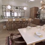
Some of my favorite features in this house was the ironwork that Dustin did inside the house. He did this great shelf to separate the entryway and kitchen along with a great opening for the family room. The family room also doubled as a homework space and catch-all area for the kids’ coats, shoes, and bookbags. Jo included some really great cubbies for their coats and such by the back door which is where the carport leads. During the course of the episode, Jo found out that Mikey was expecting her sixth child and Jo made sure to incorporate a space for their stuff also.
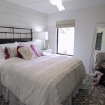
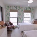
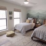
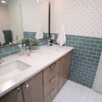
The outside of the house came out really great as well with the white brick, the wood siding, modernly styled carport and the concrete breezeblock that went up around the front patio. The interior of the house was such a mix-match of styles, but the way that Jo made them all come together was amazing. The bedrooms that we are going to get to see are the kids’ rooms. Lily’s room and Lily told Jo that she wanted shiplap in her room and for her room to be very “farm” like. The other kids’ rooms have some really cute wallpaper on them and are both very different. Their bathroom has a teal tile in it, which is Mikey’s favorite color and has a really fun wallpaper in it as well. Mikey loves wallpaper and mustard yellow, so there is a really unique mustard yellow wallpaper in the master bedroom.
Here are some of the design elements that were highlighted in this episode of Fixer Upper: Behind the Design!
Gallery: Highlights from Fixer Upper: Behind the Design
What did you think of last night’s episode of Fixer Upper: Behind the Design? Let me know in the comments below, on Facebook or on Twitter!



Be the first to comment