
Last night on Fixer Upper: Behind the Design season 1, we got a look at the design process of the Morrison’s house. We first met the Morrison’s in season 5 of Fixer Upper and they had a huge budget to work with which gave Chip and Jo the ability to really put some great details into this house. If you missed the original episode or need a refresher, check out our recap here for the details!
The Morrison’s bought a four bedroom, three bathroom house with 3572 square feet of living space. This house sits on two acres of land and came with a sports court. They bought the house for $435,000 and with their huge budget, that left Chip and Jo with $450,000 for the renovation alone.
In the wish list meeting, they both wanted something that felt was a blend of French country and traditional. The house is already pretty traditional and Jo thinks that she can add some great French country aspects to the house. There was a lot of stuff that needed to be done on the construction side of this project including removing some of the wood paneling in the living room and brightening the space.
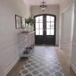
Some of the French country flair that they added came in the form of tile floors in the entryway and sanding down the built-in in the living room and lightening it up a lot. They knocked out the wall between the living room, dining room, and kitchen and really opened it up. With the vaulted ceilings and the big wall of window in there along with the natural wood beams, it looks so bright and airy in that space, but also very traditional. The kitchen is going to have a really great tile design in the backsplash, a big vent hood, and a beautiful hutch. Jo has also asked Clint Harp to make an island table for this space.
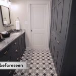
When Jo gets back to the house, we get a look at the outside of the house. She is having the brick painted white, adding dark iron around the windows and some really nicely trimmed bushes and trees. She also talks about adding a fountain to the front yard to really bring that French country look to the landscaping. Jo and her design assistant for this project are talking about the tiles for the entire house. In this episode, they are going to show us a couple bathrooms that weren’t featured in the original episode and I can’t wait to see the tiles they chose for these spaces!
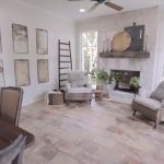
It is time for Jo to start decorating the house and it really is coming along very nicely. We find out that they decided that they were going to paint the built-in and mantle for the fireplace because they couldn’t sand it all down, but it still looks amazing. Another space that they touched base on in this episode was the sunroom that they added on with some antique brink pavers and the German smear on the fireplace. Here are some of the highlights of last night’s episode of Fixer Upper: Behind the Design!
Gallery: Highlights from Fixer Upper: Behind the Design
What did you think of last night’s episode of Fixer Upper: Behind the Design? Let me know in the comments below, on Facebook or on Twitter!





Be the first to comment