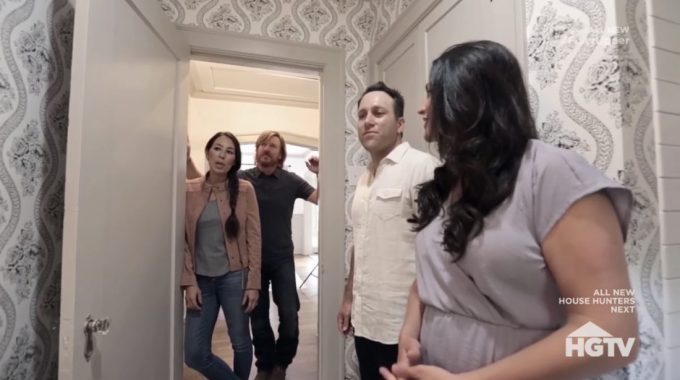
Last night on Fixer Upper: Behind the Design season 1, we revisited that Scrivano house from season 5 of Fixer Upper. If you don’t remember the Scrivano house, you can check out my full recap of the original episode right here!
We started this episode off with Joanna meeting the Scrivano’s and finding out what their individual styles are. Courtney is more of a traditional person where her husband Joey leans more towards the modern style and they both want the original Tudor style in their home. Joanna had a great idea on how to mesh the two together by doing details trims, wainscoting and neutral colors for her traditional style and smoother textures, sleek fixtures and a very clean fireplace. We were also told that we are going to see a never before seen guest bathroom.
The porch of this house, which is what gives Tudor styled homes their character, had been closed off and converted into an office. Joanna has Chip and his crew open it back up and convert it back into a porch. Almost instantaneously, the house has much more character and that Tudor style that the Scrivano’s really wanted to keep is back.
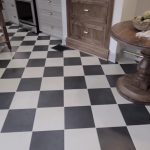
The kitchen is one place that Joanna spent a lot of time designing. She really wanted to do painted upper and lower cabinets, copper sink and then in order to break up the painted cabinets, Joanna wants to add a night stained built-in. Joanna’s design assistant isn’t sure that the wood floors in the kitchen are a good idea so they decide to use the same black and white tile floors from the butler’s pantry throughout the kitchen.
Joanna goes to visit Clint and has him design a table for the breakfast nook. I am always amazed by Clint’s work and this is probably one of my favorite pieces from over the years. Back at the house, Joanna is amazed about how good the kitchen looks now that the tiles on the floor have been installed. She really thinks that the antique doors that lead to the butler’s pantry are going to tie in great, but she wants one more piece for that kitchen. A small island to break up all the empty space in the middle of the room.
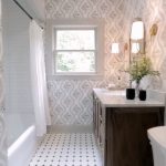
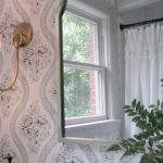
We also got a look at the wallpaper for the guest bathroom and I’m really excited to see this finished. Joanna is able to find a small island for the kitchen to really break up all the black and white on the floors. Here are some pictures of the design elements that were highlighted in last night’s episode of Fixer Upper: Behind the Design.
Gallery: Highlights from Fixer Upper: Behind the Design
What did you think of this episode of Fixer Upper: Behind the Design? Let me know in the comments below, on Facebook or on Twitter!



Be the first to comment