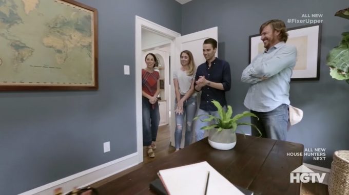
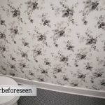
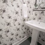
We first let Matt and Samantha on the season 5 premiere of Fixer Upper and last night we got to revisit their home on Fixer Upper: Behind the Design to see where Joanna’s design process. During the episode, we also got a look at a bonus room that they added, a half bathroom for guests, that wasn’t in the original episode. If you missed the original episode, you can find our full recap right here!
We started last night’s episode of Fixer Upper: Behind the Design season 1 with Joanna, Matt, and Samatha meeting to talk about what they wanted to see in their 1930s Tudor style home. They had three bedrooms, only one bathroom and 1400 square feet of living space. There was a great front door on the house with a moon shaped window that Samantha really wanted to keep.
Jo asked how they would describe their style and Samantha described it as Parisian eclectic. She tells Jo that she would like colored cabinets and she loves floral wallpapers. Jo has her design assistant, Lindsay, bring some titles over for the fireplace. Joanna picks out this great tile with a unique pattern on it. Lindsay also brings some wallpaper in for the master bathroom. The wallpaper is hand drawn and has a really nice and subtle grey pattern in it.
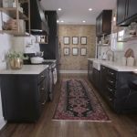
This house has a galley kitchen in it and there isn’t enough money in the budget to reconfigure it. The plan in the kitchen is to add some new lower cabinets and instead of upper cabinets, they are putting in some open shelves in so that it doesn’t feel so closed in. Jo did black cabinets, with white countertops and brass accents.
On the outside of the house, they planted a tree in front of the fireplace chimney. This tree will actually grow and attach itself to the outside of the house and add some character to the house over the years. It’s also an apple tree so they will get tons of fruit from it as well. Jo then heads over to an antique show to find some things for Samantha and Matt’s house. She finds a dining room table, some ceramic canisters for the kitchen and some little canisters for the bathroom as well.
The furniture has all been brought in and the decor is being placed. One of the things that they used for decor on the walls in the living room were framed documents which were part of the original deed of the house. It is time for the reveal! Here are some of the designs that were highlighted in this episode.
Gallery: Highlights from Fixer Upper: Behind the Design
What did you think of this episode of Fixer Upper: Behind the Design? Let me know in the comments below, on Facebook or on Twitter!

Be the first to comment