
Last night we got a better look at the design process for the Aguilar family’s house on Fixer Upper: Behind the Design. If you missed the original episode, you can find a full recap of it right here! In this episode, Mr. and Mrs. Aguilar wanted to have a modern yet Mediterranean style throughout the house. In the original episode, we didn’t get a look at the laundry room that Joanna was able to give them.
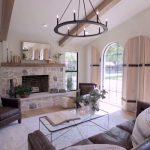
Some of the things that Jo wanted to work into this design were wood elements, stone on the fireplace, arched doorways, vaulted ceilings and concrete countertops. The really opened up the floor plan and even though the house had one less bedroom in it, you couldn’t tell that it was smaller when everything was opened up.
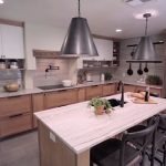
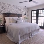
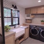
They decided to cut away some of the fireplace and make it all stone on the inside and the outside and they added windows on either side to let some extra light in. At some point in the design, Jo decided that the concrete counters in the kitchen should be marble to match these marble slabs they put up on the walls. In the master bedroom, Jo put a great antique door from an estate in for their headboard and the wall behind the bed is all stone. The laundry room had some great hand painted tiles on the walls, concrete counters and an iron and glass wall built by Dustin.
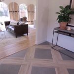
The entryway into the house has a great patterned floor with concrete and wood. The entry from the dining room into the kitchen was flanked with some antique doors on either side of the entryway. When it came to showing the Aguilar family their new home, they were completely blown away, but then Jo showed them their new laundry room. Here are some pictures of the design elements highlighted in this episode of Fixer Upper: Behind the Design!
Gallery: Highlights from Fixer Upper: Behind the Design
What did you think about this episode of Fixer Upper: Behind the Design? Let me know what your favorite part of this house was in the comments below, on Facebook or on Twitter!


Be the first to comment